
Coming Soon…
A must follow new page on the website, important to product designers and to who is interested in innovation
Today’s Tip
How to Clean Printed Photos
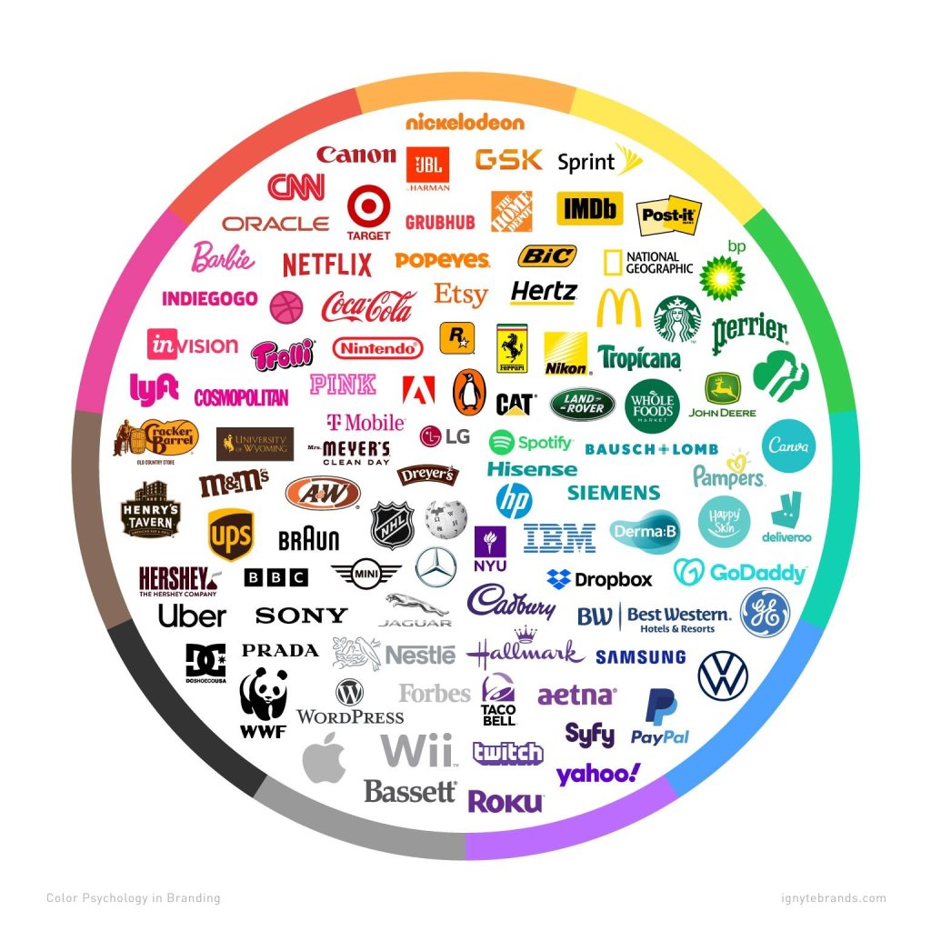
Colours of logos [Design Concepts]
While choosing the logo to your brand, think of this wheel.
I won’t pick black of a cafe. because with the dark brown of the most coffee drinks and coffee beans, it will make your brand to a dark mode. to complete the colour choice of more bright ones, or use the brown colour itself.
If you want to make photos of the coffee ☕️ the coffee will not be at top contrast. of course, there is a possibility to add black to the theme like the coffee machines or the background.
Food colours should be near to nature. you go outside in the park, and you start starving because these green, blue, off-white, and brown variations stimulate your appetite.
Some people think orange is stimulating, but I think it encourages you to buy not to drink or eat.
When picking a theme, think always of the balance of the colours. Red and black in Coca-Cola logo are making a team.
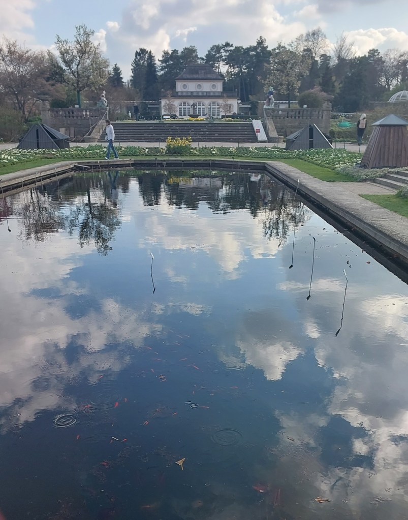
Happy Rain Drops
Magazine [ADOBE INDESIGN]
➡️Photos of a rainy day [PHOTOGRAPHY]